
The US digital banking market undoubtedly represents one of the most competitive globally. With hundreds of Legacy, Regional banks, Credit Unions and Challengers around the 50 states it is a constant battle for survival for many financial institutions.
Every couple of months a new bank springs up or attempts to penetrate the local market, shifting an already precarious balance.
While in the other blogs we have focused on US Challengers competing against each other and Challengers competing against Legacy banks, this time we are having a face of between giants. We will be comparing the digital banking capabilities of Bank of America and M&T Bank, which represent some of the oldest financial institutions in the USA.
M&T Bank was founded in 1856, while parts of Bank of America’s financial entity today trace all the way back to 1784 and 1923 – due to the large institution’s acquisition of other financial institutions over the years – before its 1994 merger to what it is today.
The two Legacy banks are listed among the 30 most popular US banks for customers. According to a recent research by MX, Bank of America is the second largest bank, with $2.32 trillion assets, second only to Chase. M&T Bank is found lower in the 24th place with $142,220 million assets.
We will be pitching these two legacy banks against each other to discover:
- how they stand in the US digital banking landscape
- how their offerings compare in the web and iOS channels in every digital offering category
- what features Bank of America has that M&T Bank doesn’t and vice versa
- how the UX of their provided digital features measures in every digital offering category.
Where do the two Legacy banks stand in the US market?
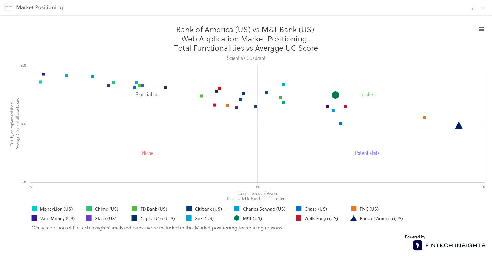
In the Web channel M&T Bank is located in the “Leaders” section of the quadrant, meaning they offer a good amount of digital offerings with great UX in comparison with the rest of the US market. Bank of America, however, is located in the “Potentialists” section with a great number of offerings but lower UX-evaluated journeys. As can be seen the majority of the US financial institutions are found in the "Specialists" section with a few of them crossing over to the "Leaders" section. M&T Bank seems to have the upper hand on the desktop offerings.
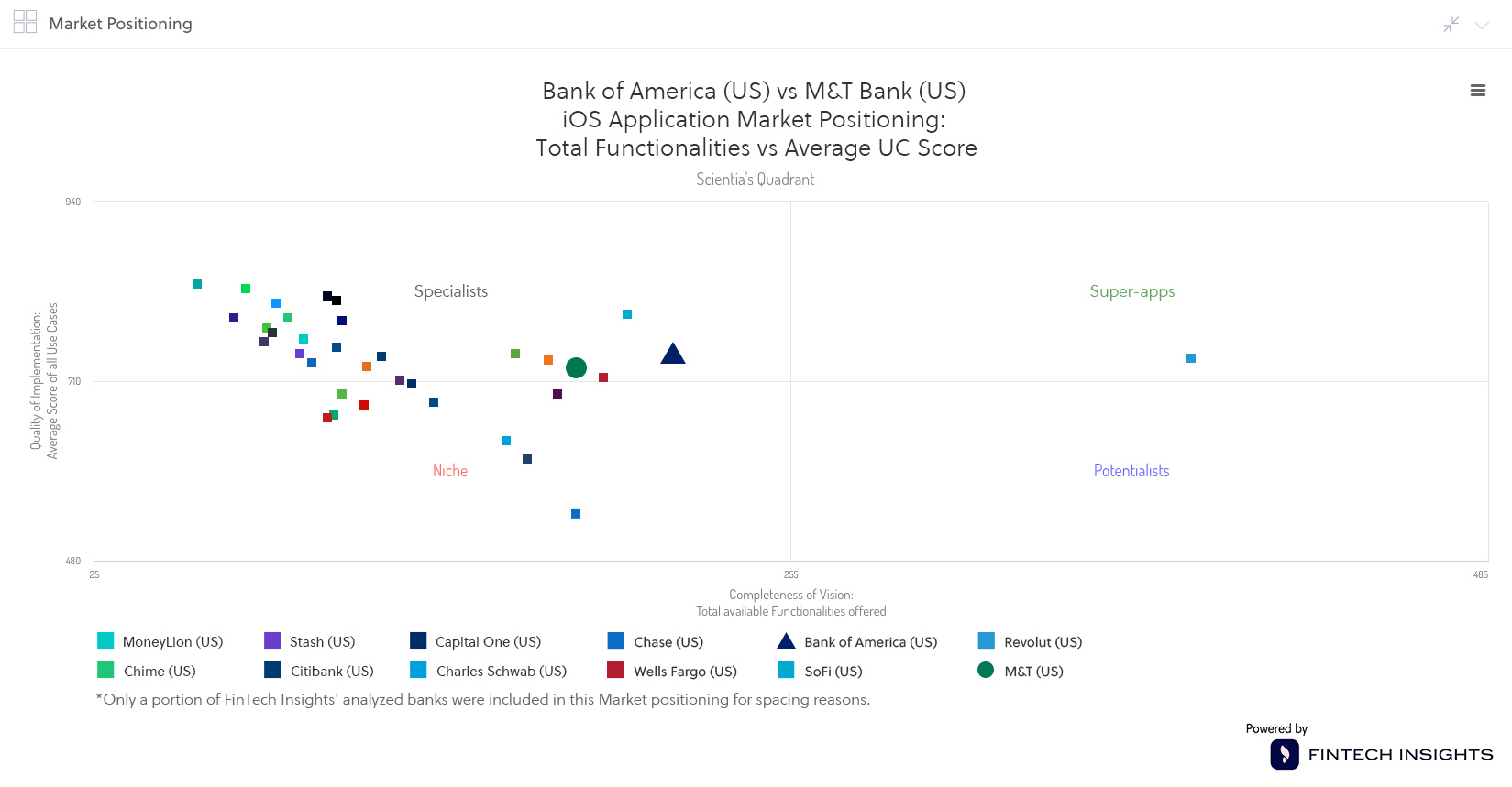
Regarding the iOS channel both banks are positioned in the "Specialists" section meaning they offer great UX user journeys but a lower amount of digital banking offerings. As illustrated above the majority of the US financial institutions are found in the same quadrant as M&T Bank and Bank of America. A few of them are located in the "Niche" quadrant while only one, Revolut, leads the pack in the "Specialists" quadrant with an increased number of features and equally high-evaluated UX.
Functionalities ranking per channel
%20vs%20M%26T%20Bank%20(US)%20%20Web%20%26%20iOS%20App%20%20.png?width=2440&name=Gap%20Analysis-%20Bank%20of%20America%20(US)%20vs%20M%26T%20Bank%20(US)%20%20Web%20%26%20iOS%20App%20%20.png)
In the web channel Bank of America offers 298 distinct digital offerings to their customers while for the same channel M&T Bank offers 216. For the iOS channels the total number of digital banking offerings is 216 and 183 for Bank of America and M&T Bank respectively.
To drill down further we used  , the digital banking research platform, to see how their features are distributed in different digital banking categories.
%20vs%20M%26T%20Bank%20(US)%20%20%20Web%20%20.png)
Web channel critical insights
- Bank of America offers 55 Wealth management features, 42 of which are distinct to the bank. M&T Bank offers a total of 13 features for this category, placing it a whooping 42 features behind BoFA.
- For the Accounts category we can detect a similar advantage for BofA with 52; 27 of which are distinct to the institution while M&T Bank offers 36.
- M&T Bank offers a total of 30 digital offerings while Bank of America 40 for Money Transfers.
- For the rest of these categories on the web, the two banks present an almost similar number of features.
iOS channel critical insights
%20vs%20M%26T%20Bank%20(US)%20%20iOS%20App%20%20.png)
As in the Web channel, Bank of America again offers an increased number of features for the Wealth Management category: 38. M&T Bank similarly with the web channel has a lower total number for this feature category: 13.
BoFA also has a higher number of features in the Accounts category for the iOS application as well in comparison to M&T bank with 19.
M&T Bank, however, has 7 features for the Open Banking category while Bank of America 2, illustrating the former bank’s tendency towards embracing Open finance.
It seems that the same strengths and weaknesses between these two Legacy banks are reflected in both the examined channels. Wealth Management and Accounts are clear strengths for Bank of America in both channels, while PFM and Open Banking for M&T Bank’s iOS channel.
But what are some key digital banking features that one of the Legacy bank’s has that the other should consider incorporating into their arsenal
Now let’s take a look at prominent features that are missing from one another in each channel:
3 features that Bank of America has but M&T doesn’t
Transfer dollars to another account in a foreign country in a different currency (web)Advanced Wealth Management in stock ETFs and mutual bonds (web)
Add individual recipient templates through the Web & iOS channels
3 features that M&T has but Bank of America doesn’t
Search fields for filtering transactions in the accounts section (iOS app)Open banking: connect another domestic account to M&T and have a total overview (iOS)
Advanced Personal Finance Management features (e.g., expense analysis, income analysis, cash flow analysis, bill payments overview)
Use cases breakdown
%20vs%20M%26T%20Bank%20(US)%20Web%20%26%20iOS%20App%20%20.png)
Since we have looked at what these two mega-banks offer their customers and what are the most prominent differences, it’s time we looked at how well they offer it. As can be seen in the graph above, average UX scores of the iOS channel are 747 and 728 for Bank of America and M&T Bank respectively. This is calculated with a maximum perfect score of 1000 according to FinTech Insights UX evaluation system. The same number for BofA’s web channel is 630 with M&T Bank at 787. While the banks don’t appear to have much of a difference in their average UX for the web, there seems to be, however, a clear lead for M&T Bank in the web channel.
To examine this further, let’s have a look at their UX distribution for the two channels.
Web channel critical insights
%20vs%20M%26T%20Bank%20(US)%20%20Web%20%20.png)
M&T Bank, which has more digital offerings in the Open banking category, also offers a higher UX score than Bank of America.
The above is reversed in the Money Transfers category, where BofA has more features but less UX friendly journeys for its customers compared to M&T Bank.
iOS channel critical insights
%20vs%20M%26T%20Bank%20(US)%20%20iOS%20App%20%20-1.png)
Both banks seem to offer similar UX scores for most of the categories. Notable exceptions are:
The Open Banking category where Bank of America has no features and therefore no UX scoring at all.The Wealth Management categories where Bank of America offers a larger number of functionalities and at the same time increased UX score compared to M&T Bank.
The above comparison showed that the two Legacy banks have plenty of common ground regarding their digital banking offerings and user experience offered. In the web channel, while Bank of America has a higher number of features offered to customers, it does not offer the same quality of UX, therefore placing it in the "Potentialists' section, where M&T Bank sits in the "Leader" quadrant. For the iOS both appear to have a placement on the "Specialists" mainly because Revolut tramples all other competitors with a large number of features and great UX.
Finally, a large difference between the two can be found in the focus that each place in different categories for both channels. BofA has a much more increased focus on Wealth Management digital banking offerings where M&T Bank analysis shows a focus on PFM and Open banking. It seems that BofA and M&T Bank have only to benefit from taking a closer look at each other’s capabilities and learn.
Want to drill even deeper into what these Legacy banks offer or any other bank?
Then, head to FinTech Insights and explore how you can create a market-beating digital banking feature set.
Build a digital banking strategy that can't be challenged
Let's show you how FinTech Insights can help you wow your customers, on every login.